

Quick answer: White is the correct choice for billing, legal, medical, financial, and professional correspondence. Colored wove envelopes work best for branded correspondence, nonprofit donor appeals, and programs where standing out matters but a professional appearance is still expected. Starburst envelopes are the highest-impact option for direct mail acquisition, lapsed donor reactivation, and any campaign where maximum open rates in the mailbox are the primary goal. All colored and starburst envelopes at Business Envelopes meet USPS OCR contrast requirements with standard dark ink. See all formats at colored envelopes.
The question of which envelope color to use comes up at the start of nearly every new mailing program. White is comfortable and familiar. Color feels like a risk. But the choice is not really about preference , it is about what the specific mailing program needs the outer envelope to do.
For a billing statement, the envelope does not need to earn the open. The recipient already expects it and will open it regardless. For a nonprofit fundraising appeal competing with every other piece of mail in the donor's stack, the envelope must earn its open before the message inside can do anything. Those two programs need completely different envelope color strategies.
This envelope color guide maps the color decision to the mailing program, covers USPS compliance considerations, explains custom printing on colored stock, and tells you specifically when white outperforms every colored option available.
The Core Principle: What Does the Envelope Need to Do?
Every envelope color decision starts with one question: does the outer envelope need to earn the open, or will the recipient open it regardless?
If the recipient will open it regardless , monthly invoices, utility bills, insurance statements, bank correspondence, payroll documents , the envelope color has no meaningful effect on whether the piece gets opened. The only relevant criteria are paper weight, window alignment, closure type, and whether security tinting is needed. White is the standard for all of these programs and performs exactly as well as any colored alternative at a lower cost per piece.
If the outer envelope needs to earn the open , direct mail acquisition, nonprofit donor appeals, lapsed donor reactivation, promotional campaigns, year-end giving appeals , envelope color becomes one of the most important decisions in the campaign. A piece that does not get opened delivers zero results. Color is the first and cheapest tool available for increasing open rates before any other element of the package has a chance to work.
The Envelope Color Decision Matrix
| Mailing Program | Recommended Color | Envelope Type | Why |
|---|---|---|---|
| Monthly invoices and billing statements | White | Window #10 | Recipient expects piece; color adds cost with no open-rate benefit |
| Legal correspondence | White | Plain #10 or #14 | Professional, formal tone; color signals informality |
| Medical and insurance notices | White (security tinted) | Window #10 tinted | Privacy protection required; security tinting only available on white |
| Payroll and HR correspondence | White (security tinted) | Double window check | Confidentiality; security tinting required; double window format |
| Financial statements | White | Window #10 | Authority and credibility; color risks informal appearance |
| Branded correspondence with logo | Brand-matched color (blue, red, green) | Colored wove #10 | Brand recognition; color coordinates with logo and letterhead |
| Nonprofit house-list donor appeal | Bold color (red, blue, gold) | Colored wove #10 | Stands out from standard mail; signals importance to existing donors |
| Nonprofit acquisition campaign | Starburst (multi-color) | Starburst #10 | Maximum visual attention; no prior relationship to rely on |
| Lapsed donor reactivation | Starburst or bold solid color | Starburst or colored wove #10 | Needs to re-earn attention from a disengaged relationship |
| Year-end giving appeal | Red or gold | Colored wove #10 | Urgency, season relevance; tax deadline appeals benefit from warm colors |
| Promotional and marketing mail | Starburst or bright solid color | Starburst #10 or 6x9 | High visibility; needs to compete with other promotional mail |
| Acknowledgment letters and thank-you notes | White | Plain #10 | Formal appreciation tone; white reinforces sincerity |
Colored Wove Envelopes: Solid Color for Brand and Appeal Programs
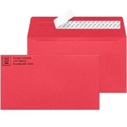
Colored wove envelopes are solid-color envelopes in one uniform color across the entire envelope face. The wove surface provides a smooth, professional appearance while the color differentiates the piece from a stack of white envelopes. Colored wove envelopes look intentional, organized, and branded , which is exactly what makes them effective for the programs that need them.
Blue: brand coordination and trust
Blue is the most requested envelope color for branded correspondence programs. It coordinates well with a wide range of corporate logo colors and signals reliability and trust. Organizations that use blue in their brand identity , financial services, healthcare, nonprofits , find blue wove envelopes the cleanest match for their mailing program. Blue is also the most versatile colored envelope for programs that need to look professional but different from white.
Red: urgency, passion, and attention
Red envelope color signals urgency, importance, and passion. In nonprofit fundraising, red outer envelopes perform well for campaigns tied to a deadline or emotional call to action. Year-end tax deadline appeals, emergency relief campaigns, and high-urgency donor reactivation programs all use red to communicate that this piece requires immediate attention. Red also performs well in promotional mail where the offer has a short expiration window.
Yellow and gold: visibility and warmth
Yellow is the highest-visibility color in a stack of mail , it catches the eye before any other color because the human eye is most sensitive to yellow-green wavelengths. For programs where the primary goal is to be noticed, yellow is the most effective solid color option. Gold is a warmer variant that works well for year-end giving campaigns, holiday mailings, and programs where the warm season context matters to the message.
Green: environmental programs and spring campaigns
Green envelope color works well for environmental nonprofits, sustainability-focused organizations, and spring seasonal campaigns. It also coordinates cleanly with brand identities in outdoor, health, and wellness sectors. Green signals freshness and renewal rather than urgency, which makes it a better fit for campaigns that invite engagement than those that demand immediate action.
For the complete guide to colored wove formats, sizes, and the wove vs starburst format decision, see Colored Envelopes: Wove vs Starburst, Sizes, Direct Mail Economics and When Color Earns Its Place.
Starburst Envelopes: Maximum Visual Impact for Acquisition and Reactivation
Starburst envelopes go further than solid color. The multi-color burst pattern covers the entire envelope face in a bold design that is immediately recognizable as a deliberate attention-getting piece. In a mailbox full of white envelopes and solid-color pieces, a starburst envelope is the one that gets picked up first.
Starburst envelopes are the correct choice when:
- You are mailing to a cold acquisition list with no prior relationship with the recipient
- You are reactivating lapsed donors who have stopped responding to standard appeals
- You are running a promotional campaign where maximum open rates are the single most important metric
- The mailing program has tested colored wove and needs a stronger format to improve performance
The trade-off is formality. Starburst envelopes are visually striking but not formally professional. They are not the right choice for correspondence that needs to project authority, credibility, or institutional trust. For those programs, colored wove or white is the correct choice.
For the complete starburst guide including format comparison, size options, and direct mail performance context, see Starburst Envelopes: When Bold Color Beats White in the Mailbox and How to Use It Right.
When White Envelopes Always Win
Several program types require white envelopes regardless of what the color strategy might otherwise suggest. These are not preference decisions , they are operational requirements.
Security tinting requires white stock
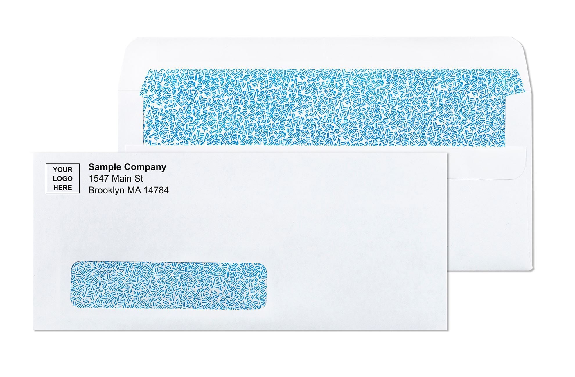
Security tinting, the interior crosshatch pattern that prevents document contents from being read through the envelope during transit, is available on white stock only. If your program involves payroll checks, financial statements, HR documents, medical correspondence, or any other content that requires read-through protection, white is the required envelope color. Colored stock does not support security tinting. For full security tinting guidance, see Security Tinted Envelopes: What the Interior Pattern Actually Does and When You Need It.
Window envelopes default to white
Window envelopes , the format that displays the recipient's address from the document inside , are the standard format for billing statements, invoices, checks, and high-volume correspondence programs. Window envelopes are available on white stock. Colored window formats exist in the catalog but are less common. For programs where window addressing is the primary operational requirement, white is almost always the default. See all window formats at window envelopes.
Legal, medical, and financial correspondence
Correspondence that needs to project authority, credibility, and institutional trust performs better in white. A legal notice in a red envelope may be read with skepticism. A financial disclosure in a starburst envelope looks like junk mail. The professional standard for legal, medical, financial, and government correspondence is white, and deviating from that standard risks the perception of the piece regardless of the quality of the content inside.
Inserter machine programs
High-volume mailing programs that run through folder inserter equipment need consistent paper stock for reliable mechanical feeding. Colored wove envelopes feed through inserter machines as reliably as white, but any program that requires absolute consistency in mechanical performance should confirm envelope specifications with the equipment specifications before ordering. For complete inserter compatibility guidance, see Direct Mail Envelopes: How to Choose the Right Format, Size, and Design for Better Response.
USPS Compliance: What Envelope Colors Are Allowed
USPS does not prohibit colored envelopes. Any envelope color can mail through the USPS as long as it meets the standard physical requirements for letter or flat dimensions and weight. The one compliance factor that affects color selection is OCR contrast.
OCR contrast requirement
USPS automated sorting equipment uses optical character recognition (OCR) to read the delivery address on the envelope face. OCR requires sufficient contrast between the envelope background color and the address text for the camera to read the characters accurately. The requirement is dark text on a light envelope. All colored wove and starburst envelope formats at Business Envelopes meet this contrast requirement with standard dark ink addressing, including direct label application and laser printing directly on the envelope face.
Barcode clear zone
Regardless of envelope color, the bottom 5/8 inch of the envelope face must remain clear of all printing and design elements. USPS applies its delivery barcode in this zone during sorting. Colored envelopes with a color that extends to the bottom edge of the face can still qualify as long as the bottom 5/8 inch zone is free of any text or graphic element that would interfere with barcode application. All standard colored and starburst envelope formats are designed with this zone in mind.
For the full OCR compliance breakdown including the contrast requirement, reflectance values, and what happens when an envelope fails OCR screening, see Colored Envelopes: Wove vs Starburst, Sizes, Direct Mail Economics and When Color Earns Its Place.
Custom Printing on Colored Envelopes
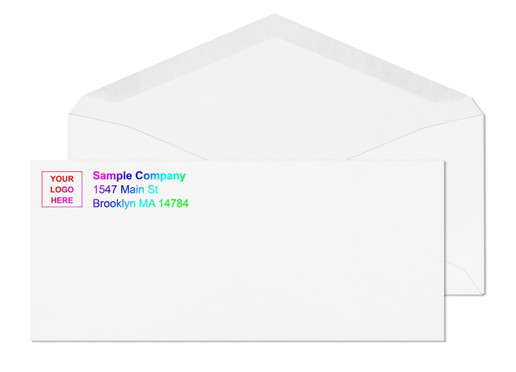
Custom printing adds your organization's logo and return address to any envelope format, colored or white. On colored envelopes, custom printing creates two layers of brand impact: the color of the outer envelope that gets noticed in the mailbox, and the logo that confirms the sender's identity before the piece is opened.
Ink color on colored stock
Dark inks print cleanly on colored wove stock. Black ink on a blue, red, yellow, or green envelope produces a clear, readable return address and logo. Light inks on dark envelopes reduce contrast and can affect both readability and USPS OCR compliance for the address zone. The standard approach for custom printed colored envelopes is dark ink on the upper-left corner for the logo and return address, using the natural contrast between dark ink and the colored envelope background.
Logo and brand color matching
For brand-matching programs, select the stock envelope color closest to your brand color and confirm the match with a physical proof before ordering volume stock. Exact color matching requires custom manufacturing that is beyond standard commercial envelope production. Selecting the closest available stock color and adjusting the logo ink color to complement it is the practical standard for branded envelope programs.
For complete custom printing specifications, file format requirements, and proof process details, see Custom Printed Envelopes: What Gets Printed, How It Works and Why It Matters.
Why Business Envelopes for Colored Envelope Programs
Business Envelopes has supplied colored wove and starburst envelopes to direct mail programs, nonprofit organizations, marketing agencies, and businesses since 1997. The colored envelope catalog includes wove formats in assorted colors, starburst formats in multiple sizes, and custom printing on both.
- Colored wove #10, #9, and 6x9 in assorted colors including blue, red, yellow, and green
- Starburst envelopes in #10, #9, 6x9, and 9x12 sizes with multi-color burst pattern
- Custom logo and return address printing on any colored format with PDF proof before production
- All formats meet USPS OCR contrast requirements with standard dark ink
- No minimum order on any format
- Same or next business day shipping on blank stock
- Free ground shipping on every order
- Artwork stored on file for automatic reorders
See all colored envelope formats and sizes at colored envelopes. For the reasons color envelopes work and when they earn their cost premium, see Why Using Colored Envelopes Makes Marketing Sense.
What Customers Say About Colored Envelopes
★★★★★ Richard from TN, Verified Buyer | #10 Starburst Printed Envelopes
"We used the blue starburst for an advertising campaign and the response was overwhelming!! It definitely jumps out of the boring pile of mail!!"
★★★★★ Jacob, Verified Buyer | #10 Starburst Printed Envelopes
"People actually open these! I bought them to mail overdue invoices, and guess what!? Yes, everyone makes time to open these striking bright envelopes!!!"
★★★★★ Mike, Verified Buyer | #9 Colored Printed Envelopes
"I always go for the blue wove envelopes since they coordinate with our stationary beautifully. Its definitely a must have for us!!"